We were approached by a previous client, Jaya Da Costa, to design a new identity for her charity venture, Fresh, that aims to help impoverished children in Dorset.
With such a fantastic opportunity to help children and young adults, we were asked to create a logo design that would incorporate bright colours and a more ‘edgy’ look in order to appeal to both age sectors. We decided to use a rough-edged box and grungy typeface to give it a slightly ‘graffiti’ look, whilst still keeping it clean and modern. The colours are bright and vibrant, with the dark grey helping the blue and pink stand out further.
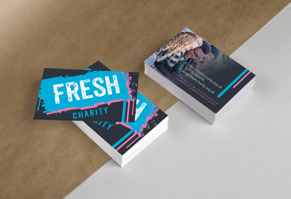
Once the logo was complete, we created marketing material, such as business cards and letterheads, to generate brand recognition.
We feel that the overall look serves a fantastic purpose and the design and marketing considerations help to being this identity alive.


